 Book now
 De Stijl explained through one house in Utrecht
Primary colours, straight lines and planes that never quite touch. What the Dutch movement believed, and where to spot each idea on the Rietveld Schröder House.
If you know one painting by Piet Mondrian, you already know the look of De Stijl: black lines on white, and a few blocks of red, yellow and blue. The museum that runs the Rietveld Schröder House describes it as if a Mondrian painting had leapt into three dimensions. That is a good first impression, but the house is more interesting than a painting made solid. It shows what happened when a small group of Dutch artists' ideas about colour, line and space were applied to a real family's daily life. This guide explains those ideas in plain terms and then points to where you can see each one, from the pavement and from inside.
What De Stijl was
De Stijl, Dutch for "The Style", was an art movement founded in the Netherlands in 1917. Its organiser was the painter, writer and critic Theo van Doesburg, and De Stijl was also the name of the journal he published to spread the group's ideas. Its members included the painters Piet Mondrian, Vilmos Huszár and Bart van der Leck, the architects J. J. P. Oud and Jan Wils, the sculptor Georges Vantongerloo and, from its early years, a furniture maker from Utrecht called Gerrit Rietveld.
The Netherlands stayed neutral in the First World War, and its artists were cut off from Paris, then the centre of the art world. In that isolation, the De Stijl artists set out to find a new visual language that would be universal rather than personal: not a picture of a tree or a face, but an order of lines, planes and colours that anyone could read.
It was never a tight-knit group. Members came and went, much of the conversation happened by letter, and some of them never met at all; Mondrian and Rietveld are said never to have met in person. The movement effectively ended with van Doesburg's death in 1931, but its ideas carried on in the work of its members and in modern architecture more widely.
The rules, in plain language
Mondrian called the theory behind the movement Nieuwe Beelding, usually translated as Neoplasticism. Stripped down, it came to a handful of rules.
Use straight lines only, horizontal and vertical. Use rectangles and squares, not curves. Limit colour to the three primaries, red, yellow and blue, plus the three non-colours, black, white and grey. Avoid symmetry, and find balance instead by setting elements against each other: a long horizontal against a short vertical, a large white plane against a small block of red.
A further idea mattered most for furniture and buildings. In many of the group's three-dimensional works, lines and planes are set in layers that don't intersect, so each element keeps its own identity rather than disappearing into a solid mass. A board passes in front of another board; a wall stops short of the corner; a beam runs past the point where it would normally end.
Around 1924 van Doesburg added diagonal lines to his own work under a theory he called Elementarism, and Mondrian broke with the group over it. The Rietveld Schröder House was built in exactly that year, and it stays loyal to the horizontal and vertical.
Why this house is the movement's building
Plenty of buildings were influenced by De Stijl, including J. J. P. Oud's work in Rotterdam and the Aubette interiors in Strasbourg. The Rietveld Schröder House is usually described as the one building created entirely according to its principles. When UNESCO added it to the World Heritage List in 2000, the committee called it an icon of the Modern Movement and an outstanding expression of the ideas developed by De Stijl.
There is an irony here. Rietveld did not involve the movement's other members, including van Doesburg, in designing it; it was made by Rietveld and Truus Schröder together. The house became a De Stijl landmark because De Stijl magazine published it, four times, with both their names beside the photographs.
Reading the façades
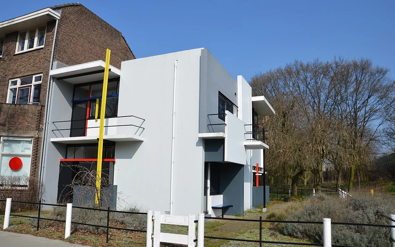
Stand on Prins Hendriklaan and look at the house as a collage rather than a box. The walls are flat planes in white and several greys. Window and door frames are black. And here and there a thin line of colour appears: a yellow post rising the height of the house, red and blue bars across the upper windows.
Now look at the edges. The planes are deliberately detached from one another and seem to slide past each other, so that one wall projects beyond the next and a roof slab overhangs the corner. That sliding of planes is what makes room for the balconies, and it is why the house never reads as a single heavy block. The architect was trying to avoid exactly that impression of a solid mass.
Notice, too, how little the house cares about its neighbour. It shares a wall with the last house of a brick terrace, but it makes no attempt to match it in height, material or style. The contrast is part of the point.
The colour is functional, not decoration
It would be easy to think the colours are simply applied for effect. On the façades, though, they were chosen to strengthen the sense of planes and lines, the plasticity of the building: white and grey for surfaces, black for frames, and the primaries only for linear elements. The colour tells you how the house is put together.
The same logic runs inside. The same palette and the same planes continue from outside to inside, so there is very little distinction between interior and exterior. Even the windows follow the rule: they are hinged so they can open only at 90 degrees to the wall, which keeps the crisp right angles between planes intact even when the house is open to the garden.
Inside: space instead of rooms
The ground floor is the more conventional part, rooms arranged around a central staircase, much as in other houses of the time. The radical part is upstairs, and it is where De Stijl's ideas about space rather than colour come through.
Instead of a fixed set of rooms, the upper floor is a changeable open zone. Sliding and revolving panels divide it into bedrooms, a bathroom and a living room, or fold away to leave one open space, with many states in between. A wall is no longer a permanent line on a plan; it is a plane that can move. That is the non-intersecting, independent element of a De Stijl chair, applied to a whole floor of a home.
Look out for the corner window upstairs, which a member of staff will show you working. Like the other windows, it is designed around the same right angles as the façade, and it is one of the places where inside and outside come closest.
The chair that came first
Before the house, Rietveld had already made De Stijl's ideas into an object. His Red and Blue Chair, first made around 1917 and 1918, is a frame of separate wooden parts, each with its own position, and it was painted in its primary colours in the early 1920s. Each board and batten stays distinct, overlapping rather than merging, exactly as the walls of the house would a few years later.
The comparison is direct: like the chair, each component of the house has its own form, position and colour. Seeing Rietveld's chairs first, at the Centraal Museum in the city centre, is a good way to train your eye before you visit the house, or to confirm what you have seen after.
Built of ordinary materials
For all its abstract look, the house was built with practical compromises. Rietveld first wanted to build it in concrete, but for such a small building that proved too expensive. In the end only the foundations and the balconies were concrete. The walls are brick and plaster, the floors, window frames and doors are wood, and steel girders help carry the structure. The flat, smooth surfaces are a finish over a fairly traditional build.
How to look during your visit
The multimedia tour starts outside, and it is worth taking your time there. Pick out one horizontal and follow it across the façade until it stops. Find each line of colour and ask what it is doing: marking a post, a frame, an edge. Count the planes in the corner where the roof slab overhangs.
Inside, stand in the middle of the upper floor and imagine the panels shut, then open. Ask the staff to show you how a panel moves rather than touching it yourself, since nearly everything is original and fragile. And when you come back downstairs, look out of the windows at the apartment block across the street on Erasmuslaan, which Rietveld and Schröder designed together a few years later.
A short glossary
Neoplasticism: Mondrian's name for the theory behind De Stijl, built on straight lines and primary colours. Non-colours: the movement's term for black, white and grey. Elementarism: van Doesburg's later variation, which allowed diagonals. Plane: a flat surface, treated as an independent element rather than as one side of a box.
How De Stijl travelled
De Stijl was a small movement, but its ideas reached a long way. The group had close links with the wider European avant-garde, and its journal listed cities from Leiden to Paris, Hanover, Brno, Vienna and Warsaw on its cover. In 1923 Walter Gropius invited Rietveld to exhibit at the Bauhaus in Germany, and the movement's ideas fed into both the Bauhaus and the International Style of modern architecture that followed.
Mies van der Rohe was among the architects who took up its principles, and its influence can be traced as far as the Eames House in California. In 1951 Rietveld himself designed a major retrospective exhibition about De Stijl, shown in Amsterdam, Venice and New York, which revived interest in the movement and in his own work.
The Rietveld Schröder House sits at the start of that story. When you stand in front of it, you are looking at an idea about lines, planes and open space that went on to shape a great deal of twentieth-century architecture, built at the scale of one family's home.
Frequently asked
Is the Rietveld Schröder House a De Stijl building?
Yes, and it is usually described as the only building made entirely according to De Stijl principles. Rietveld built it with Truus Schröder in 1924, and it appeared four times in the movement's magazine.
Why are only red, yellow and blue used?
De Stijl limited colour to the three primaries plus black, white and grey. On the house the primaries appear only in thin linear elements, while white and grey cover the walls and black marks the frames.
Did Mondrian design the house?
No. The house is by Gerrit Rietveld and Truus Schröder. Mondrian was De Stijl's leading painter, and the museum compares the house to one of his paintings in three dimensions.
Where can I see Rietveld's furniture in Utrecht?
The Centraal Museum in Utrecht holds the largest Rietveld collection in the world, and its permanent collection always shows chairs, drawings and models by Rietveld. It needs a separate ticket.